Let’s face it, when it comes to designing email, it’s not pretty. Advertisers need to design with one goal in mind: getting the email into the target audience’s inbox. There are many factors to take into account when crafting your email: different email clients (Outlook, Gmail, etc.), operating systems (Mac vs. Windows), and the device (mobile, desktop, tablet) on which your audience is viewing your email. Ask yourself, what’s more important to you? A “pretty email” with lots of images that lands into a junk folder and remains unseen, OR an email optimized for delivery that gets in front of as many eyeballs as possible. See our email design best practices below:
Clear call to action
Your call to action, or CTA, is the most important part of an email. This is what drives the consumer to take action and ultimately, yields results. CTA’s need to be easily identifiable, enticing and are far more important that the “aesthetic” of the email creative. We at Media Prowler have seen beautifully designed emails with a poor CTA perform horribly and ugly emails with a great CTA drive fantastic results.
Image-to-text ratio
Let’s be honest: most of us don’t read emails, we scan them. Think of your email as the appetizer to the full course meal (your landing page or website). People don’t want to read through lines and lines of text to understand your offer so try and make your copy short and sweet. While images are great and will help grab your audience’s attention, including too many images will increase the chances of your email being flagged as spam. In general, you should aim to have a 60/40 text to image ratio.
Responsive design
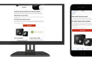
75% of consumers view their email on their phone. Therefore, we believe every email should be responsive, or designed to adapt itself to whatever device is being used to view it. None of us want to pinch and zoom to read the text on an email that was not coded responsively — in fact, over 70% of users will delete an email that does not display correctly. Responsive design is a quick & easy way to increase your email’s deliverability!
HTML
If you are coding your email yourself, keep in mind that your email will display differently for readers based on their email client. Use tables to structure the layout of your email, and inline CSS to stylize your content since many email clients do not support separate CSS files. Do not rely on images to relay your message to the reader, since some email clients block images automatically. When it comes to HTML and CSS, remember that the simpler the code is, the less room there is for error across multiple email clients.
Web safe fonts
Normally, we could spend hours poring over different fonts to use in our creative. There’s good and bad news regarding fonts in email design: you won’t have to spend a lot of time choosing fonts for email design, but that’s because there’s a limited number of fonts that are universally available on every computer. We recommend sticking with standard fonts such as Arial, Helvetica, Tahoma, Times New Roman, and Georgia. If you do want your email to have a little more pizzazz, consider using web fonts! These fonts are hosted on a server and then download by the email client; Google fonts has over 800 beautiful fonts to choose from (seriously, look at how pretty their website is!).
To sum it up…
Focus on a great call to action, be mindful of your text to image ratio, design responsively and use web safe fonts! Designing for email can be tricky but applying these best practices will help get your email into your target audience’s inbox.


