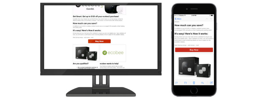
Responsive Email Templates
There are many responsive email templates available from many different sources on the web. We have our own posted here.
The Goal
The goal of all types of responsive emails is to make sure that everything is visible and legible on ANY SIZE screen without requiring the user to scroll side to side or zoom in or out to see your message. That goes from the smallest 300 pixel phone screen all the way to Retina or 4K 30″+ Desktop displays. While the goal is clear and easy to understand, there are many ways to accomplish this all with varying degrees of difficulty and effectiveness. We’ll outline a few that we use below.
“Responsive”
Most of our templates are of the generic “responsive” type, which means that they use Media Queries. What are Media Queries? With out going into the nuts-and-bolts conversation, just know that media queries allow the email to detect the screen size of the device that it’s being viewed on. This is very important, as it allows the email coding to adjust based on the screen size. It’s almost like writing two (or more!) different emails into one code. If the screen size is big enough it displays as normal, but if the screen size is too small to fit the width of the standard design a change is made to make the email appear differently on the smaller screen. Most often this will take the form of arranging content that was in two or three columns and make them one column. The standard breakpoint for our emails is 600px, so if the viewing area is less than that, you’ll see the mobile version. This can also involve resizing images, meaning that we need to have higher quality images so that when they move from a 300 pixel column to a 550 pixel column, they still look presentable.
“Fluid-Hybrid”
Fluid-hybrid emails are a relatively new type of e-mail design. The main goal in using a fluid-hybrid design is that you don’t need to use media queries to accomplish the responsive actions of the email. Media queries can be difficult to understand and modify after they’ve been implemented, and some email clients don’t even work with them. Fluid-hybrid designs are simpler, and usually have smaller file sizes, which makes them load more quickly in the email client. As far as the pictures go, they can be coded in multiple ways, so we can be more flexible in design. If you want your images to remain the same size now matter how your email is viewed, this may be a great option for you, but we can also scale images so they stay full width. That’s part of what makes this a “hybrid” design.
“Scalable”
We don’t use this type of email here at Media Prowler, and in fact in the truest definition it’s not really a responsive email at all. This is designing your email for the lowest common denominator, or basically designing for mobile and allowing that to determine all of your email’s characteristics. While this works, it can often leave some visual appearance lacking on the larger desktop screens.
How can we help?
As mentioned at the top, we have our responsive templates available as design guidance. These templates are mostly just basic outlines, and we can and will adjust them to fit whatever images you want to use and copy you have.
A couple things to remember!
Responsive emails are usually limited to 600px wide, so keep that in mind! When you want to work with multiple columns, you can run out of space very quickly! Also use larger resolution photos than you think you need, when the email adjusts to mobile screens you might find your images are much larger!


